5 Tips For Testing End Card Templates

Creative has always played an important role for user acquisition campaigns – but with limited access to the IDFA, increasing competition, and decreasing attention spans, performance marketing increasingly relies on the right testing strategy and creative toolset to effectively convert impressions into customers. And as long as video remains the dominant format, video end cards will continue to drive significant engagement and performance. We’ve seen our end cards increase clicks by 17% and conversions by 126%.
But as preferences change, so does the ability of an end card’s visual elements to convince a user to convert. The CTA buttons, fonts, colors and messages that once elicited the desired user response a few months ago may flat line, while creatives that previously had marginal success may now drive a significant lift in yield. And even if your end card is hitting performance benchmarks, it always has the potential to do better. To be sure you are getting the highest return from your end card before ad fatigue sets in, you need to test even the smallest change of each and every creative attribute. Plus with the growing use of HTML, the number of variables to test has increased.

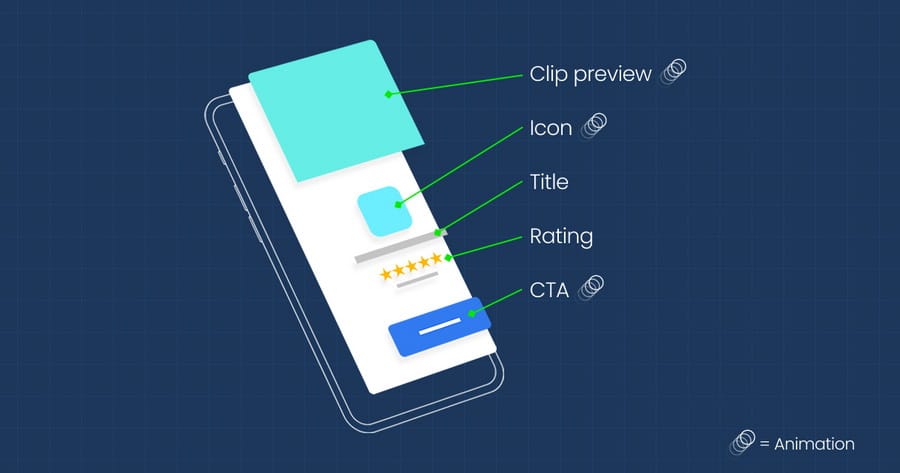
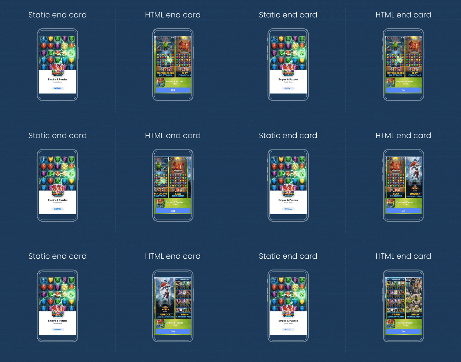
Prior to 2020, less than 1% of LifeStreet bid requests were HTML eligible. Between May and July 2021, HTML end cards are now 25-75% of total video ads served, depending on the ad exchange. An HTML end card, like its static predecessor, includes basic information all of which can be modified like app title, icon, and CTA – but HTML also incorporates animation (e.g. motion, animation, gameplay depth, etc.), which can incorporate an infinite number of changes.

With the seemingly endless number of possibilities to test, where do you begin? Whether you are running creative tests in-house or working with a third-party creative studio or DSP, here are a few steps to help you make data-driven creative decisions confidently and quickly that have a positive impact on performance.
Step 1: Have Context.
Before any test, you must have context. Spending some time conducting qualitative and quantitative research of your end cards will help you identify which elements to focus on first. Have certain elements been running untested for months? Have other templates been tested recently? What types of end cards are competitors running?
LifeStreet’s proprietary video repository has collected more than 20,000 ad experiences over the past 5 years. With this tool, we can observe the different creative avenues competitors are using. While we don’t know how those ads are performing, we are able to select which elements we want to test so our partners can capitalize on what seems to be working for their target audience. (It’s safe to assume that if several advertisers are employing the same creative element for an extended period of time, then it’s working).
For example, from our repository, we noticed more and more CTA buttons featuring animation of bursting shapes – circles, stars, or sparkles – in multiple color offerings. When we tested this design, we saw an 18% observed lift for end cards with a burst CTA animation button and now 55% of LS playables leverage burst CTA buttons.
Step 2: Have a Hypothesis.
Iterative testing doesn’t need to be complicated, but it does need to be deliberate. You must be able to answer the question: “Why am I testing this single element and what do I think will happen?” A hypothesis will help you focus on how you want to evaluate performance.

And guess what? Your hypothesis about the impact of a creative change on the user experience could be wrong, and that’s OK. Don’t go with your gut, trust the data. That is unless the numbers look too good to be true, then they probably are. In which case, you should run another test and revisit the statistical significance level (the probability that the event could not have occurred by chance).
Step 3: Pick a Testing Methodology.
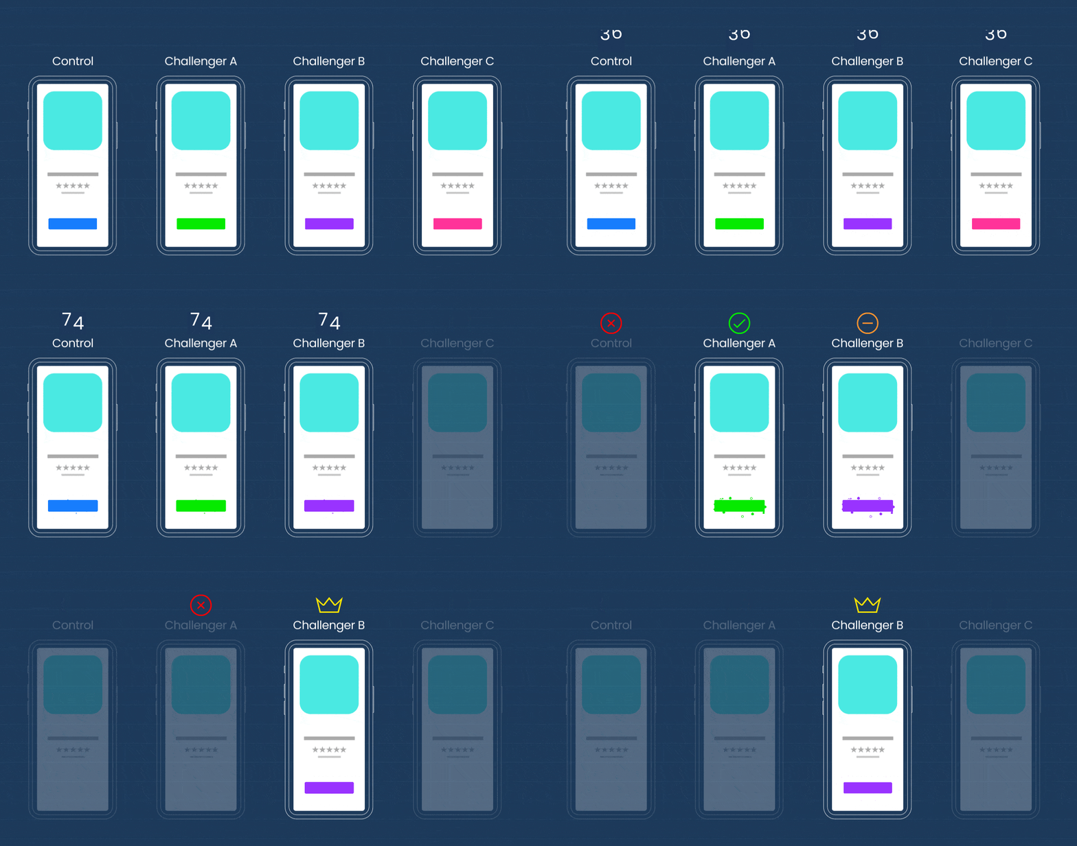
There are a few different testing methodologies, but we rely on A/B testing. The end card that we think will perform best is the control and it is tested against three different challengers. The challengers are the exact same end card as the control, except one element is changed.

After we run the first test, the poorest performing variation is removed and we repeat this process until we are left with a clear winner. A/B testing has two main advantages for our advertisers:
- Easily identifies which image, copy, or CTA is driving engagement and should be applied to future designs.
- Minimizes risk to performance because only small changes are made that are easy and quick to apply. If we see positive results, we can incorporate these changes in the ad rotation to see if the observed lift becomes a trend.
Step 4: Execute Quickly.
The faster you can test, the faster you can find the optimal creative and often this comes down to removing bottlenecks and automating time-consuming tasks.

Step 5: Test, Test, and Test Some More.
The more you test, the more you will be able to explore – in a scientific way – what captures your audience’s attention and what engages them most. For one client, over a three month period, we created 167 ads and ran 212 different tests and within each test there are always 2-4 creatives being tested against the previous winner. Of those 212 tests, 31% produced lifts (increase in yield which is conversions/impressions*1M).

Creative Science
Iterative testing should always be a part of your creative process. By testing each change in isolation, no matter how big or small, you might be surprised to discover what attributes (and modifications of those attributes) actually drive people to install an app. And precisely because the unexpected can and does work, an evidence-based approach prevents gut decisions from taking over an experiment and your creative.


