8 Ways to Improve Your App’s Product Page Localizations and Attract More International Users

Product pages on iTunes are available in 39 different languages. On Google Play, the number is even higher: You can provide up to 84 localizations.
Even if your app is not available in all of these languages, it makes sense to provide as many localized versions of your app description, screenshots, and videos as possible. Approaching potential users in their native language will show them that you respect their culture and make them more likely to download your app.
Proper localization goes way beyond a word-by-word translation though. In this blog post, you will learn 8 ways to make your localization a better experience for international users.
1. Don’t use Google Translate
It is convenient to use free translation software like Google Translate for single words or short phrases. But the longer the text, the worse the results. In the worst cases, the context gets lost completely. Have a look at the following text snippets, taken from the English and the German app description of the game Shoot Goal Football Stars Soccer Games 2019.


On a word-by-word basis, the German translations aren’t wrong, but in the context of Soccer, they don’t make much sense. The term Season should be translated to Saison instead of Staffel and Ziel must be replaced by Tor.
2. Create Individual Localizations for each Country
Apple as well as Google allow you to create multiple localizations for the same language. On iOS, for instance, you can create:
- Four localizations for English (U.S., U.K, Australia, Canada)
- Two for French (France, Canada)
- Two for Spanish (Spain, Mexico)
- Two for Portugues (Portugal, Brazil)
- Two for Chinese (Simplified, Traditional)
As language habits can differ significantly on a country level, although the official language is the same, this makes perfect sense. For example, Soccer and Football describe the same sport, but the first is a US term, while the second is used in the United Kingdom and Australia. Even more confusing, Football is the name of another sport (American Football) in the United States.
Similar differences exist in French. For locals in France, it is common to use Anglicisms like Shopping. But French Canadians have much stricter translation policies and would translate this term to Magasinage.
Using the wrong term as a keyword can harm your app’s visibility in search rankings, but also irritate users who read it in your app description. Thus, you shouldn’t copy and paste localizations. Instead, create individual translations for each country.
3. Choose the Right Language Style
Depending on the context of the app, you have to choose either formal or informal language to address potential users. While the differences in English are rather small, they are significant in other languages. Besides, they are applied in different contexts.
In German it is perfectly okay to address potential users of a leisure app or a game with informal language. In the context of a business or banking app, however, formal language would be a better fit. Other rules apply for France: addressing any stranger with informal language will be perceived as rude, no matter what the context is. So, before writing your translation, make sure that your approach is appropriate for your audience.
4. Use Local Metrics
It is the details that give people the impression that you really care about them. Numbers and metrics are such details. Because of different decimal and delimiter markers, the same number looks different depending on the language. Here is an example:
1,499.99 : English
1.499,99 : German, French, Italian and most other European Languages
In Asian languages, the numbers system can be even more complicated. So, educate yourself about syntax when translating to these languages.
Besides numbers, also make sure to use the metrics people are used to. This is crucial for apps that deal with distances, weight, dress sizes, currencies, temperature, or other measures.
5. Adjust Text Lengths
Depending on the language you translate to, the length of text elements can increase (or decrease) significantly. Let’s take, for instance, the phrase “Try our app now” which might be a decent caption for an app screenshot. It translates to “Essayez notre application maintenant” in French, so text length increases from 15 to 36 characters. To fit this translation into a screenshot, you would need to decrease the font size dramatically which would harm the readability. To avoid this unpleasant experience for users, better to shorten or rephrase the text.
6. Show People Content They Can Identify with
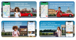
Showing regional content is a good way to give people the feeling that your app was built for them. Have a look at the iOS product page of Google Maps. Each set of localized screenshots shows landmarks that are relevant to the target audience: The Statue of Liberty for Americans, the Colosseum for Italians, the Eiffel Tower for French, and the Brandenburg Gate for Germans.

If it makes sense for your app, follow the same approach and show people content that they know and can identify with.
7. Make Sure Your Content is not offensive
Some content might be offensive for people for cultural or religious reasons. In these cases, adjustments are mandatory.
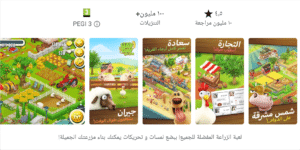
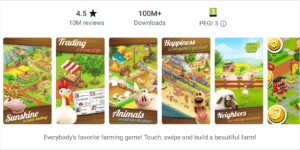
Check out the English and the Arabic screenshot set of the farming game Hay Day. The English set contains a screenshot showing a pig. But for the Arabic product page the app owners didn’t use this screenshot because pigs are considered impure in many Arabic countries.


If you use emojis, also make sure they are appropriate for your target audience. For instance, the Thumbs Up and the OK emojis are signs of approval in Europe. But in some African and Latin American countries, they are terrible insults.
Always check the cultural meaning of your content to avoid pitfalls like this.
8. Adjust Your Color Scheme
Finally, double-check the colors you use in creatives. People connect colors subconsciously to values, attributes and feelings, but these meanings descent from their cultural backgrounds. That means that people from different parts of the world might associate very different meanings to the same color. White, for instance, stands for peace, cleanliness, purity, and elegance in Western cultures. But in Asian countries like China or Korea, white symbolizes bad luck, death and mourning, which makes it the color traditionally worn at funerals. Thus, if you want to avoid that people associate negative meanings with your app, adjust the colors you use on localized product pages.
Creating localizations that address local language habits is not easy, and if you are not a native speaker, this task might cause additional costs. Nevertheless, it is worth the effort, because great localizations will improve your app’s visibility and conversion rates around the globe.


