The Intersection of Culture and Design: A Comparative of Japanese and Western Apps

In the rapidly evolving world of mobile applications, Japan’s mobile app market, notable for its size and unique culture, presents challenges for marketers. As the third-largest spender globally on in-app purchases, set to exceed $17.7 billion by 2023, its appeal is undeniable.
Yet succeeding in Japan requires more than just technical prowess. My work in localization and designs for Japan has shown how cultural nuances significantly impact user interface and marketing elements. It raises an essential question for app developers and marketers alike: How critical is cultural adaptation in design, and what role does it play in resonating with a distinct audience like Japan?
The purpose of this article is to explore and compare the differences in Japanese and Western app design, and to identify how deep-seated cultural values and historical context influence these design decisions. A comprehensive understanding of these distinctions becomes pivotal for businesses and developers aiming for international success.
What’s the difference?
To dive deeper into the influence of culture on design, it is essential to first recognize the basic style characteristics of Japan and the West.
Japanese Design
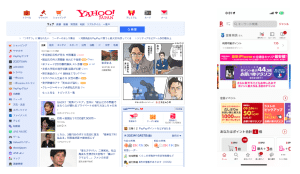
Renowned for its high information density, Japanese design often features pages brimming with text, images, and elaborate details. This style deviates from strict grid structures, preferring more intricate layouts that incorporate bright colors, detailed graphics, and animated characters — a nod to the widespread “kawaii” (cute) culture. The result is a vibrant, lively visual experience where multiple elements are harmoniously integrated into a single space. This design approach is evident in various digital mediums, from websites to mobile apps.

Western Design
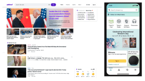
In stark contrast, Western app design typically embraces minimalism, favoring clean and uncluttered layouts. The emphasis is on large visuals and minimal text, supplemented by ample whitespace, to foster a clear and straightforward user experience. Typography is usually bold and clear, serving distinct calls to action and guiding users towards specific interactions. This design philosophy prioritizes simplicity and directness, aiming to deliver information and functionality with clarity and efficiency.

Understanding the Roots of Design Differences
Why do Japanese and Western design look so distinctly different? The designs produced reflect these cultural essence of that country, indicating that the designs are perceived as an extension of the identity and lifestyle of the people of that region and are at the core of their creative output. The key to unlocking this mystery is understanding the cultures. It shapes the very way we present information to the world, including in design.
Way of Thinking: Holistic vs Analytic
In understanding the divergence in design philosophies between the East and the West, the groundbreaking studies by psychologists like Dr. Richard E. Nisbett provide crucial insights. His research, particularly on cognitive processes, illustrates the profound impact of cultural differences on perception and thinking.
In one experiment, Japanese and American participants were shown short animated videos of underwater scenes. When asked to describe what they saw, Americans predominantly mentioned the larger, foreground elements, like a big fish, while Japanese participants often described background details and relationships between elements, such as a small frog in a corner. In a separate study involving photography, Americans tended to take close-up photos of people, focusing on individual features, whereas Japanese participants captured individuals within their broader environment, emphasizing the context.

Culture and point of view – Richard E. Nisbett and Takahiko Masuda.
He found that Easterns think “holistic,” view the environment and its elements as interrelated, and emphasize the relationship and integration of contrasting elements. In this approach, individuals tend to perceive the world as interconnected and are more likely to focus on relationships and context. Instead of breaking down a situation into individual components, holistic thinkers are more inclined to understand things in relation to the whole picture.
Western thought is ‘analytic,’ with a focus on individual elements and their attributes, employing formal logic to understand and categorize behaviors. This cognitive style focuses on objects and their attributes, often breaking down complex scenarios into simpler, constituent parts to understand them better. Analytic thinkers are more likely to apply formal logic and rules, and they often prioritize the individual over the group.
Communication: High Context vs Low Context
High Context Cultures
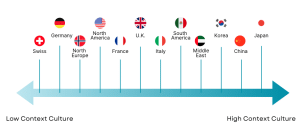
Japan is a prime example of a high-context culture. Japan, as an island nation, has developed in relative isolation, leading to a largely unified ethnic composition. In such environments, communication can rely heavily on the underlying context and shared understanding. This shared background includes cultural norms, historical experiences, and unstated rules that members of the society are familiar with. Consequently, in high-context cultures, much is communicated implicitly, with nuances and subtleties playing a significant role. This preference for implied meanings and contextual cues is reflected in the layered and information-rich design.
Low Context Cultures
Conversely, low-context cultures, such as those predominant in the United States, Germany, Switzerland, and Scandinavian countries, place a higher value on direct and explicit communication. In these societies, where there is often a diverse mix of backgrounds and experiences, it’s necessary to clearly and explicitly state information, as assumptions about shared knowledge cannot be made. Conversations tend to be more detailed and explanatory, assuming that the listener does not have access to the same context or background knowledge unless it is expressly shared. This preference for clarity and directness is mirrored in the minimalist and functional design.
The high-context and low-context framework helps explain why Japanese designs are dense, rich in visual storytelling, and often assume a level of shared cultural knowledge, while Western designs tend toward simplicity, clarity, and universal understandability.
Comparison of Japanese and Western app design
With an understanding of the distinctive cultural and cognitive background of Japan and the West in mind, let’s dive into some real-world design examples. This exploration will not only reveal how culture shapes design but also bring to life the abstract concepts of “Japanese” design we’ve discussed.
1. Aesthetics and Visual Design
Colors: Pastel colors vs Vivid
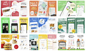
When browsing through app store screenshots in Japan, one can often notice a preference for pastel color usage. The colors appear bright, as if white has been mixed into every hue, and there’s a tendency to use these light, pastel tones over large areas (creating a grayish effect). This trend spans various app categories but seems particularly pronounced in lifestyle and utility apps.
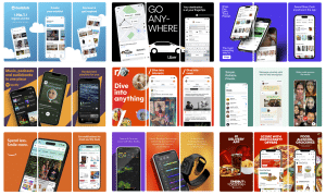
App Store Screenshots Japan (Left) and U.S. (Right)
In contrast, the US app store features very vivid background colors, enhancing the contrast with smartphone mockups and text, which makes the focal points more distinguishable. A characteristic feature is the limited use of additional colors besides the main background hue, lending a distinct simplicity to the design.
In Japan, the distinct and vivid changes of the four seasons have deeply influenced art, design, and culture for centuries. Each season is associated with specific colors derived from nature. For instance, cherry blossom pink in spring or the fiery red and orange hues of autumn leaves. These seasonal colors have a significant place in Japanese aesthetics and are often reflected in design choices, including app interfaces. Pastel colors, with their soft and subtle nature, may echo these seasonal palettes, resonating with the cultural appreciation of natural beauty and transition.
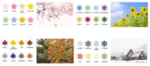
The holistic thinking prevalent in Japanese culture, which emphasizes the interconnectedness of various elements within a design, could also explain the preference for pastel backgrounds. When integrating multiple elements – be it text, images, or animations – into a single interface, a softer, lighter background might be preferred as it allows for a harmonious blend of all components. Rather than creating a stark contrast between the main subject and the background, the aim is to achieve an overall balance and unity within the design. Pastel colors, with their understated and muted tones, are ideal for creating such an effect, where no single element dominates, but rather, all parts contribute to a cohesive whole.
Illustrations : Deformat vs Realizm
In Japanese app design, the prevalent use of characters and 2D illustrations in apps, advertisements, and screenshots can be attributed partly to the widespread “kawaii” (cute) culture. This inclination towards cute, charming designs has deep roots in Japanese visual culture and is reflected in digital interfaces. The holistic tendency in Japanese design philosophy also plays a role here, where illustrations are used not just for visual appeal but to evoke an emotional response, thereby creating a more engaging user experience. By using characters and thematic illustrations, designers can create a narrative and emotional connection, which is a crucial aspect of holistic design.
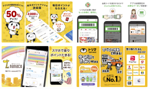
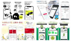
Screenshots from lifestyle category (left) and finance category (right)
Japanese illustrations often feature clear outlines and a certain degree of stylization or deformation in characters. A comparison between the search results for “犬 イラスト” (dog illustrations in Japanese) and “Dog Illustrations” in English on Google highlights the differences in artistic taste and style between Japanese and Western illustrations. The Japanese illustrations tend to be more stylized, often with less emphasis on realistic shadowing and more on clear, expressive lines.

Image search result by “dog illustrations” in Japanese (Left) and English (Right)
The characteristics of Japanese illustrations have historical roots. For example, the use of anthropomorphized animal characters can be traced back approximately 800 years to the Choju-giga, often considered the earliest form of manga in Japan. The Choju-giga (Scrolls of Frolicking Animals) shows a preference for stylized, somewhat deformed drawings rather than realism. This style may be influenced by the materials and methods used historically in Japanese art. Traditional Japanese watercolors, commonly used in paintings, are less conducive to detailed shadowing compared to oil paints used in European art. Additionally, the practice of laying the canvas parallel to the ground, as opposed to the vertical easel setup used in oil painting, may have influenced the style of Japanese art, making it more challenging to directly reference real-life objects and leading to a more stylized form of expression.
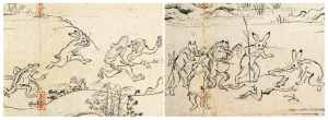
The Choju-giga (Scrolls of Frolicking Animals)
2. Information Density and Layout
At first glance, the differences between Japanese and Western app UIs might not seem pronounced, primarily due to the global influence and adoption of design standards set by companies like Apple. Their emphasis on simplicity and intuitive design has become a benchmark across the world, including Japan. This is evident from the OS market share in Japan, where approximately 70% of smartphone users prefer iPhones. Consequently, many Japanese-developed apps have embraced this trend of straightforward, function-focused design, aligning with international standards.
While global design standards have influenced app UIs worldwide, a distinctive aspect where Japanese and Western apps often diverge is in their approach to information density.
Many Japanese apps, especially in categories such as news, e-commerce, and entertainment, favor high information density. In other words, a lot of data, text, images, and interactive elements are crammed onto a single screen. The high context nature of Japanese communication, where much is conveyed by implicit consent, is reflected in these UI designs. Since there’s an assumption that the audience shares a common background and understanding, designs can afford to be more complex and layered. Users are expected to decipher and interpret these layers based on their shared cultural knowledge. Developers know that users of their services are accustomed to processing large amounts of visual and textual information quickly, and they assume that they can find comprehensive information at a glance without the need for excessive navigation or searching.
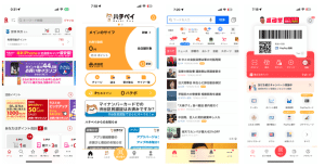
From left to right (Rakuten – Shopping, Hachi Pay – Finance, Yahoo – News, PayPay – Finance)
3. Versatility vs. Specialization
Japanese Apps: Embracing Versatility
In Japan, the tendency for apps to offer a wide range of features within a single platform reflects not just a preference for convenience and efficiency, but also a deeper cultural inclination towards group harmony and collectivism. This approach, evident in multifunctional platforms like LINE, aligns with the Japanese cultural ethos of valuing the group and community. By integrating various services – messaging, social media, payments, gaming – into one app, there is an emphasis on fostering a sense of community and interconnectedness among users. This multifunctionality resonates with the holistic thinking and high-context nature of Japanese society, where group needs often take precedence, and diverse functionalities coexist within a single, harmonious platform.
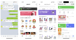
LINE: From left Messaging, E-gift shop, Sticker shop, and Payment features
Western Apps: A Focus on Specialization and Individualism
In contrast, the Western preference for specialized apps mirrors a cultural emphasis on individualism and personal identity. Western apps tend to focus on excelling in one specific function – for example, WhatsApp for messaging, Instagram for photo sharing, PayPal for payments – reflecting the analytic thinking and low-context communication style prevalent in these cultures. This focus on specialization caters to individual preferences and the desire for a tailored, optimized user experience. It underscores a societal value placed on individual achievement and clarity, where each app serves a distinct, individual purpose, aligning with the Western preference for directness, specificity, and individual functionality.

Whatsapp: Message, Setting, Status, Call
Cultural Context for Successful Localization
Understanding this cultural context is paramount to localization. Effective localization involves more than linguistic translation; it requires adapting design elements to resonate with the cultural context and user expectations of each specific market. By infusing designs with cultural insights, creators can craft experiences that appeal to a diverse and global audience.
Ultimately, the process of design, whether for digital interfaces, graphics, or products, calls for an acute awareness of cultural nuances. Recognizing and responding to these nuances is crucial in creating designs that not only captivate but also meaningfully connect with people across different cultures. As we navigate an increasingly globalized world, the fusion of cultural understanding with design innovation becomes the cornerstone of creating universally engaging and relevant designs.


